Warp Zone Events
Warp Zone Events - Case Study
Project Overview
The idea for Warp Zone Events came from seeing busy students and workers who like to attend social events-myself included-but who lack the time to do research on when and where new events would happen. To help solve this issue I designed an app that could allow users to find events happening in their local area without having to spend lots of time scrolling various websites or local postings. All the information they would need would be centralized on the app; easy to find and filter through to get to the events that matter to them.
This project was created as part of the Google UI/UX design Certificate program so I only acted as a UX Designer on the project, which means my responsibilities included:
Conducting Interviews
Creating paper and digital wireframes
Creating low and high-fidelity prototypes
Conducting usability studies
Accounting for accessibility
Iterating on designs
Understanding the User
To start of the project I conducted interviews and created empathy maps to understand the users I would be designing the app for and their needs. Through research I identified university students who explore downtown in the evening as one of the primary user groups. I used the research gathered from this user group to confirm my initial assumptions as well as reveal new factors limiting users from being able to attend fun events. These new factors included issues such as finding easily accessible information for these events and getting updates when an event has a change of date or venue.
Starting the Design
Paper Wireframes
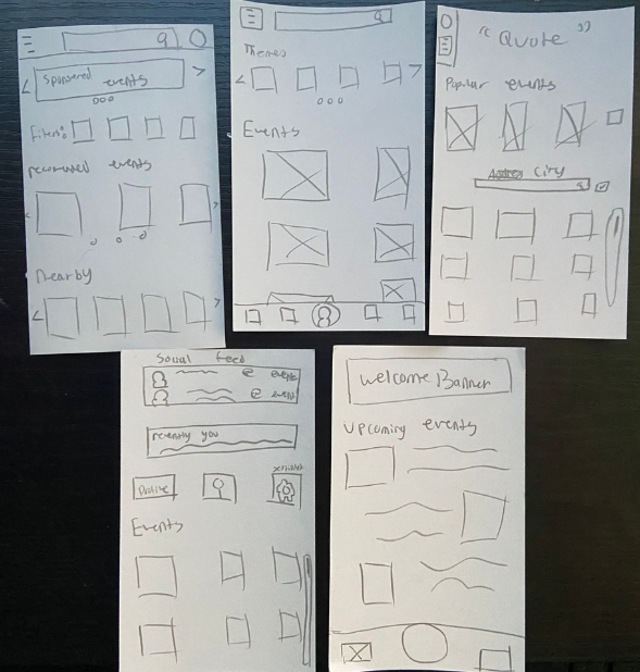
Utilizing Paper prototyping I was able to quickly iterate over several designs for the home screen to determine the one that would benefit users the most. I found the crazy 8 design exercises to be quite helpful for generating ideas quickly, even if I didn’t use some of the crazier designs it. This allowed me to find pieces from each design to combine into one final design. In the end I decided a design that focuses on displaying events front and center while keeping navigational menus hidden until needed would be the most beneficial.
Digital Wireframes
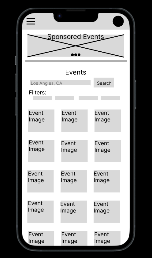
After picking designs from my paper wireframe I moved onto the creation of the digital wireframe, incorporating the portions of each design iteration that helped to address the “pain point” found in the user research. As mentioned in the paper wireframing stage; I made sure to keep the events, and a way to search them, front and center. This, along with including ways to filter for specific events to fit a users preference proved to be the most important for usability. I also created a quick profile screen wireframe as I found some interest in the social aspect of the app from the user research as well.
I utilized flashcards to emulate the screen size restriction on a smart phone
The home screen digital wireframe.
Low-Fidelity prototype
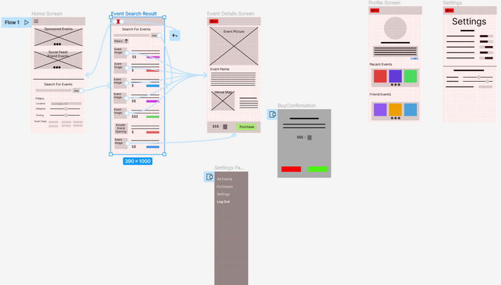
After creating digital wire frames for the main user flow in Figma I went through the steps to create the low-fidelity prototype to get feedback from a usability study. The low-fidelity prototype connected the primary user flow of searching and purchasing a ticket for an event and accessing various menus, such as the profiles screen, using the side navigation menu.
If you are curious you can try it out using this figma link.
Refining the design
Usability study
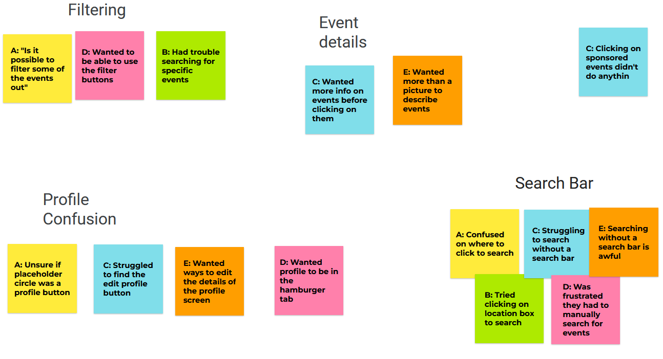
After receiving feedback I organized some of my finding into groups or related issues.
After the completion of the Low-fidelity prototype it was time to get some feedback from users to see if their pain points were being addressed and that new pain points weren’t being created. After collecting the feedback from several testers it looked like the design was heading in the right direction but some issues were found. Specifically, users found navigation a little difficult with it being hidden all the time behind the hamburger menu. Along with this the initial grid display for the events seemed to overwhelm users and leave them confused. It seemed like users preferred having less events displayed at a time if they had some small details describing the events as they scrolled. I created a spreadsheet to take notes of all user concerns and incorporated their requests into the mockups.
The new changes to the search and navigation menu
Mockups
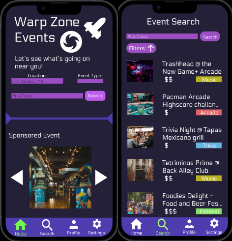
The initial design was focused on quick event discovery but the grid based layout was messy and overcrowded, which affected the usability of the app. To remedy this I decided to split the home page up by creating a dedicated search page. The home page was now cleaner and only featured suggested and sponsored events as a way to get users thinking about what events they may like. They could then input a location and be taken over to the event search page which uses a single column layout to display the evens in a more organized manner. This new layout provides an image, a short monetary description, as well as an event tag to quickly describe the event to users who scroll by.
Another featured change was an update to the navigation menu which previously utilized a side menu that would slide out when needed. To address users frustration about confusing navigation a simplified navigation bar was added to the bottom of the screen with both icons and text. This helps users quickly navigate to each page with a clear icon to describe what to expect from these screens.
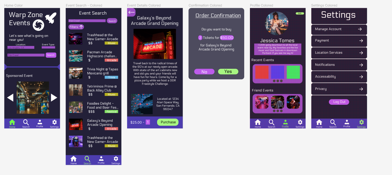
Some mockup designs for other screens. If you are curious about the hi-fidelity protoype you can check it out here.
Going Forward
Takeaways
From this process I learned about how important the iterative process is to reworking a design to fit a users needs. Features rarely remain unchanged from the beginning to the end of the design process but by iteration and utilizing user feed back you can create strong designs that fit with what users truly want. I can see the visual improvement from trying a variety of designs and then utilizing my findings from the usability study I organized.
Next Steps
If i was to continue iteration on this app I would start with another round of usability testing to study whether all the pain points users initially experienced have been effectively addressed through the current apps design and features. Along with this I would want to do another pass over the app specifically targeting accessibility so as to improve the user experience for all users. To me it is very important to make sure no one is left out in the design process so the range of people who can enjoy the app is as wide as possible.
