Snapshot Designs
Snapshot Designs - Case Study
Project Overview
Snapshot Designs is a website aimed at simplifying the process of creating custom clothes for any occasion. Whether it be making uniforms for a sports team or designing clothes for a personal celebrations the goal of the website was to create an experience for users that allowed them to quickly and effortlessly design new clothes and patterns. I wanted to design this website due to my own experience of frustration when using similar websites to make t-shirts for a class trip. Despite the hours I had put into planing out and trying to creating the shirts I found myself frustrated with the process and dissatisfied with how the final product turned out. I aimed to remedy those frustrating experience through my own designs for this website.
This project was created as part of the Google UI/UX design Certificate program so I only acted as a UX Designer on the project, which means my responsibilities included:
Conducting Interviews
Creating paper and digital wire frames
Creating low and high-fidelity prototypes
Conducting usability studies
Accounting for accessibility
Iterating on designs
Understanding the User
At the beginning of this project I conducted user interviews to investigate some of the pain points my target audience face when using similar websites. One of the common issues I found was that users would find them unsure of the limitations around design clothing. It was noted that certain websites hide details about the design process such as estimated cost, size of design areas, or even what areas can be customized till later on in the process. User communicated that it would leave them feeling frustrated as they would spend lots of time creating a design only for it not to fit on the piece of clothing or even to be the right size for what they wanted. This combined with the other commonly mentioned issue of complicated design tools on certain website made the overall experience unenjoyable to the users I interviewed. To avoid creating a similar process I created User Personas and a Journey Map to plan out the users flow through the website so I could identity possible pain points and opportunities to improve their overall experience.
Starting the Design
Sitemap
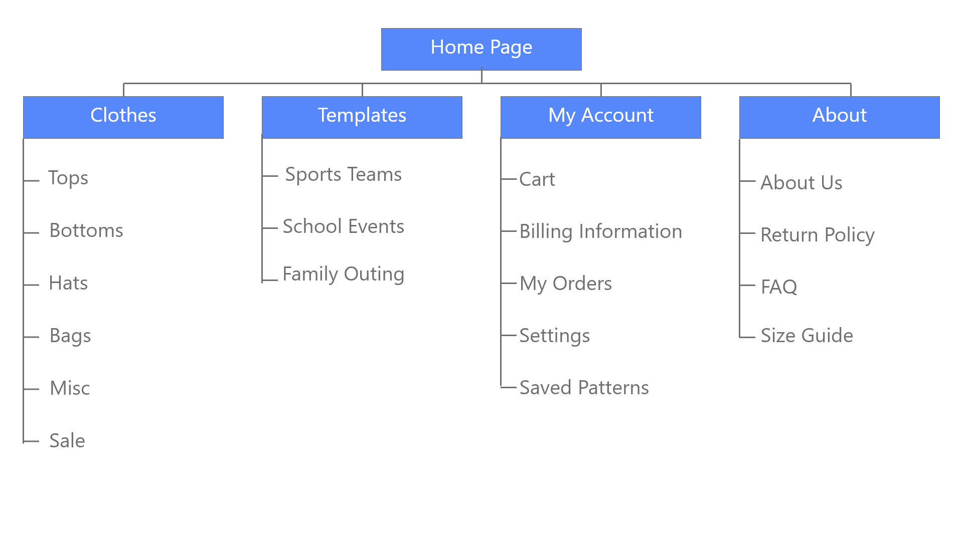
To address the difficulty users had face with other websites organization I create a sitemap to plan out how i was going to layout the various pages. My goal here was to make strategic architecture decisions that would improve navigation. Specifically I wanted to make the structure intuitive to users and make navigation simplistic.
Paper Wireframes
Next it was time for paper prototyping, for this stage I utilized my tablet to quickly iterate over the home screen keeping in mind navigation, user flow, and clear visuals to get to a design that would be intuitive to users. After using the crazy 8s design exercise I was able to distill some of my favorite designs from among the list and consolidate them together. The combined wireframe for the home screen focused on clean design that previewed the catalogue of clothes a user could customize.
Digital Wireframes
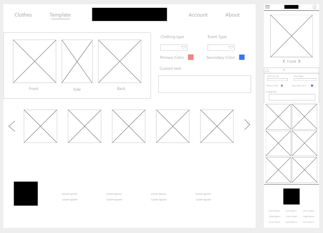
Moving from paper to digital wireframes it became easier to see how the design could address the users “pains points” and improve their experience over all. I used a panel of cards layout to help showcase some of the clothing users could customize as this layout provide easily accessible information and a visual preview of the product. Along with this I added a navigation bar at the top center of the page allowing for easy navigation to pages of most importance.
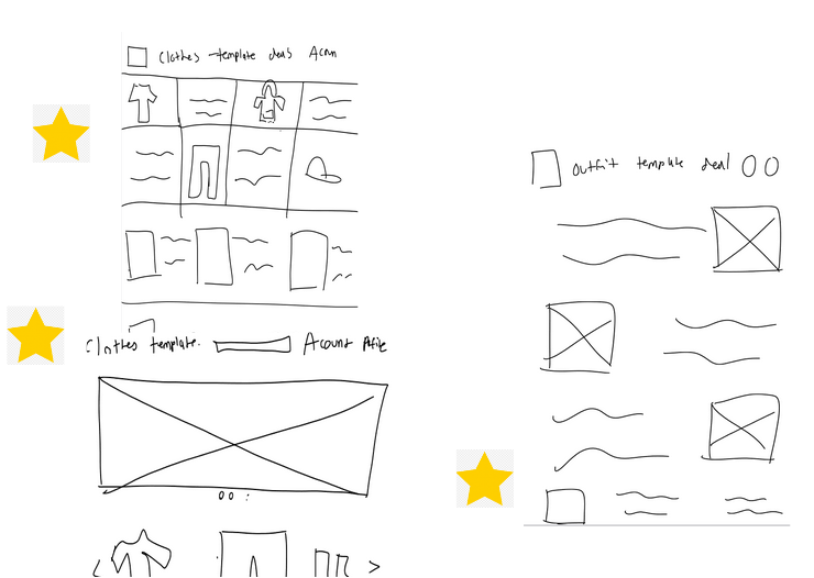
After sketching I put a star next to the portions of the designs I want to use.
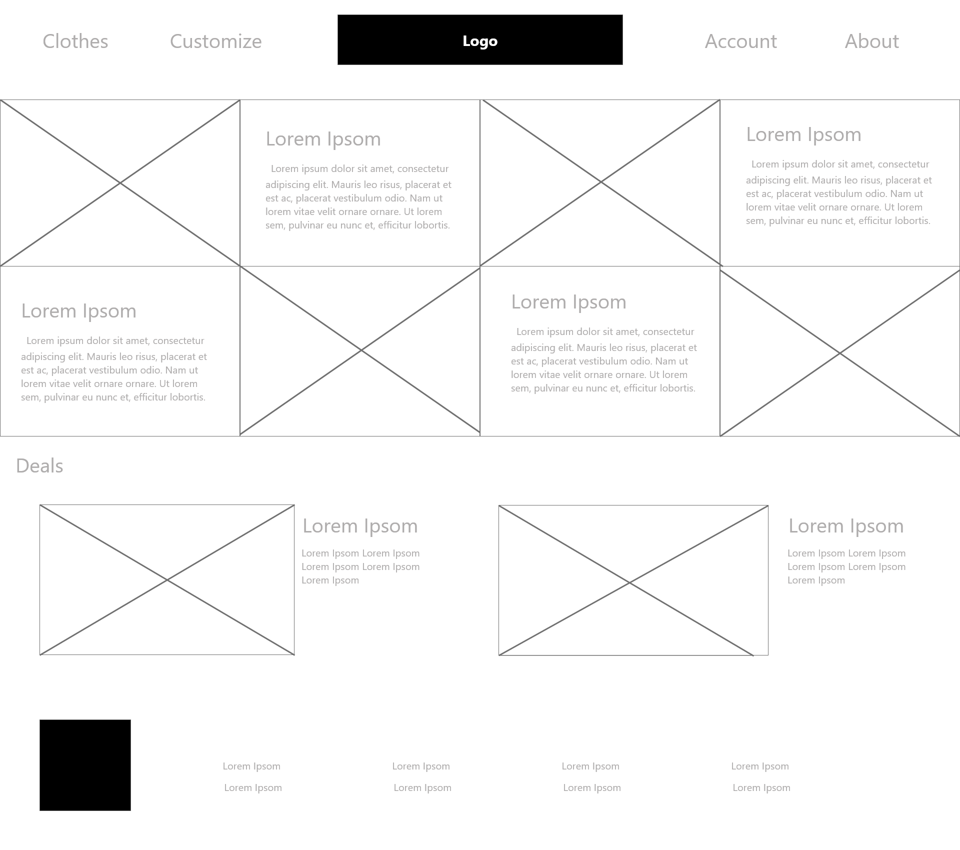
The home screen digital wireframe.
Responsive Design
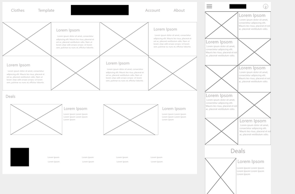
Snapshot Designs’ customers expressed interest on accessing the site on a variety of different devices, so to account for this I started to create mockups for additional screen sizes to make sure the site would be fully responsive and usable on different screens. Primarily I designed screen variations for mobile as it is one of the most commonly used platforms and represent one of the biggest growing market of active users.
Low-Fidelity prototype
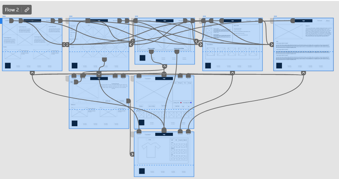
After creating digital wireframes for the main user flow in Adobe XD I went through the steps to create the low-fidelity prototype to get feedback from a usability study. The low-fidelity prototype connected the primary user flow of finding and customizing a shirt from the site. Before presenting it for the user study I took some time to review the flow to add any missing pages to improve the users experience before getting feedback.
If you are curious you can try it out using this Adobe XD link.
Refining the design
Usability study
After the completion of the Low-fidelity prototype it was time to get some feedback from users to see if their pain points were being addressed and new pain points weren’t being created. After collecting the feedback from several users it looked like the design was heading in the right direction but some issues were found. Specifically users struggled to find the customization page and the shopping carts from beneath their respective sub menus. Along with that users found the flow from moving from creating a template to customizing a shirt to feel clunky and wished their was an easier way to specify which page they wanted to go to. I made notes and documented these findings to help guide my decisions as I created the mockups for the other pages, applying necessary changes to improve the users experience.
The new changes to the search and navigation menu
Mockups
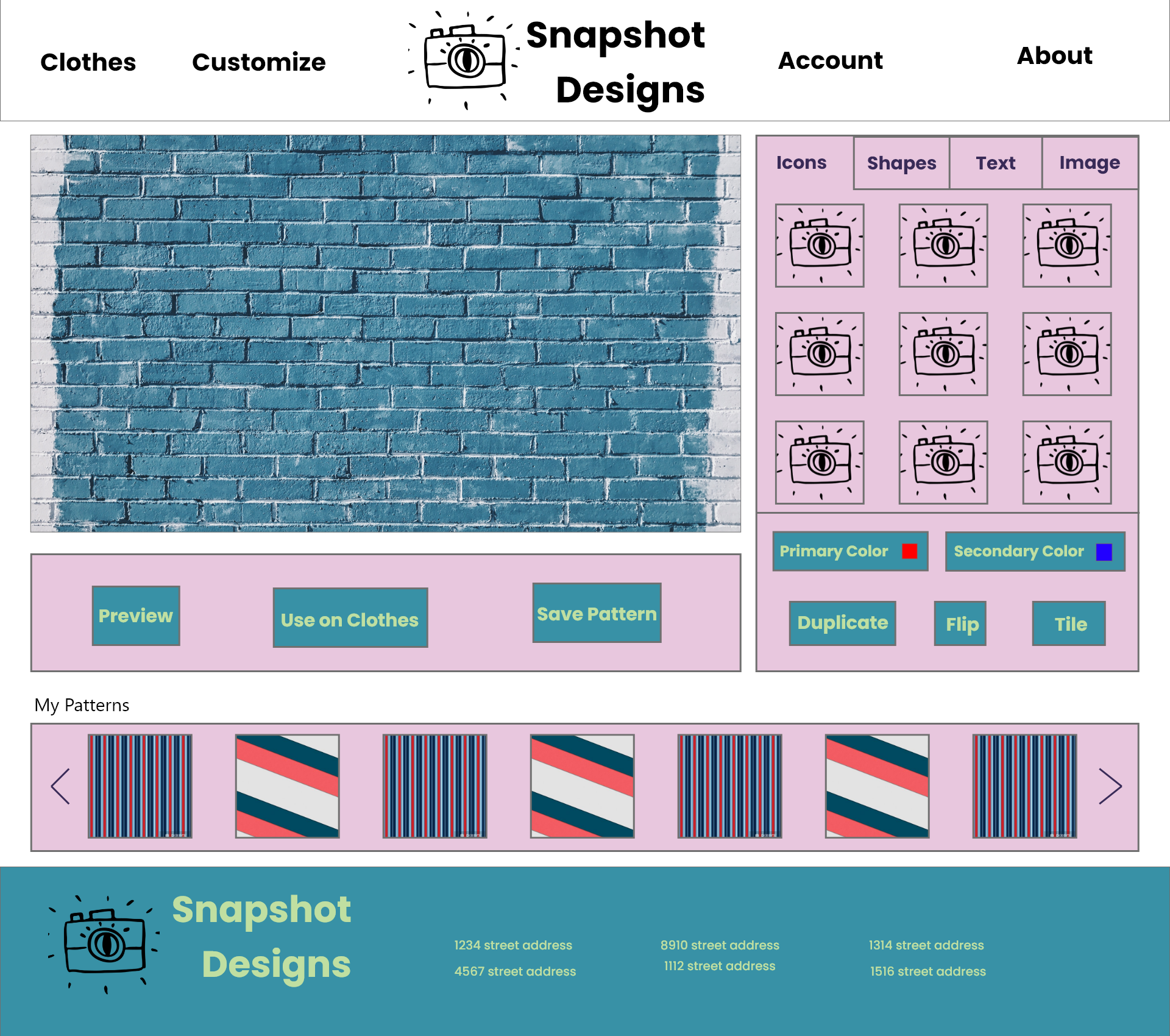
From the feedback of the usability study the overall layout felt good and wasn’t in need of change, but what needed to be improved was the the user flow in regards to customizing a shirt. Before, you would go to the clothes tab to be able to start customizing a shirt but that was a counter intuitive to most users. To remedy this I changed the main navigation flow, now users navigate to a ‘customize’ page which would prompt users with a decision on if they are creating a template or customizing clothes. This change will make navigation much more clear and also allow users to directly take the patterns they work on to the customization screen to apply to the clothes they desire.
Along with this, tweaks were made to the shopping cart screen and its location to better assist users in finding where it was located. It was moved to be visible when under the clothing tab as well as after customization so a user can easy modify and manage their cart. Other changes included a tab to upload your own image to be used in a pattern or to be printed directly on an article of clothing and new filters for sorting though available articles of clothing.
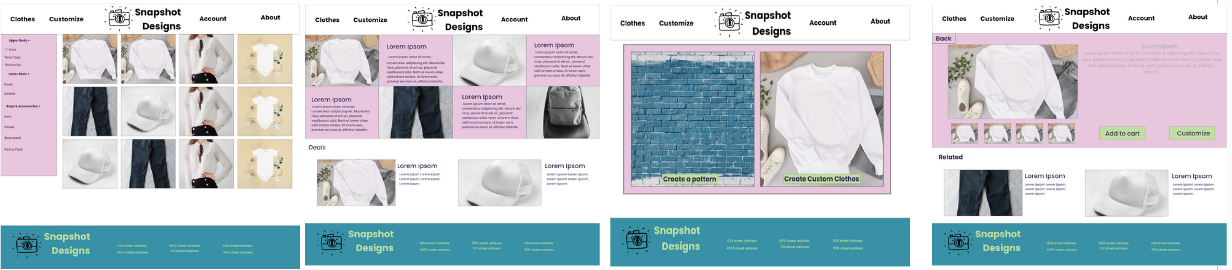
Some of the other mock ups. Check out all of them as well as the hi-fidelity prototype over on Adobe XD.
Going Forward
Takeaways
From this process I learned that even small design changes can have a huge impact on the user experience. Whether that be a shift in the layout of a page or using a different word in the navigation menu, these changes can greatly improve your design. It all comes down to your users and determine what their real needs are for the website or application you may be designing. Keeping the user in mind when coming up with design ideas or solutions helps make sure their experience is what they expect and prefer.
Next Steps
If i was to continue iteration on this app I would start with another round of usability testing to study whether all the pain points users initially experienced have been effectively addressed through the current apps design and features. Along with this I would want to do another pass over the app specifically targeting accessibility so as to improve the user experience for all users. To me it is very important to make sure no one is left out in the design process so the range of people who can enjoy the app is as wide as possible.