Habitat Hike
Habitat Hike - Case Study
Project Overview
Habitat hike is an app and website I went through the process of designing to take the problem of environmental preservation by providing an easy way to keep users educated. From my own experience hiking, I have noticed other people do not always care for the environment when out on a trail. Some people can venture off the trail and disturb animals in their habitats accidentally due to their lack of wilderness knowledge. To assist hikers from disturbing animals and keeping them informed about important wilderness information I set out to design Habitat Hike, a companion app to provide helpful information when out on the trail.
This project was created as part of the Google UI/UX design Certificate program so I only acted as a UX Designer on the project, which means my responsibilities included:
Conducting Interviews
Creating paper and digital wire frames
Creating low and high-fidelity prototypes
Conducting usability studies
Accounting for accessibility
Iterating on designs
Determining Information architecture
Creating responsive designs
Understanding the User
To start, I used d on my own experiences and from information I gathered for competitors websites to develop interview questions from my users to gather information related to hiking knowledge and wilderness preservation interest. Most interview participants reported having a lack of knowledge on identifying animal habitats when out on a hike and almost all admitted to not knowing what they would do if they found one. The responses received through research made it very clear that users are interested in properly caring for this habitats if they can get access to the information when it is needed. With this in mind I quickly went to work to come up with designs to provide an easy-to-use tool that could provide users with the necessary wilderness preservation information at a moments notice.
Starting the Design
Paper Wireframes
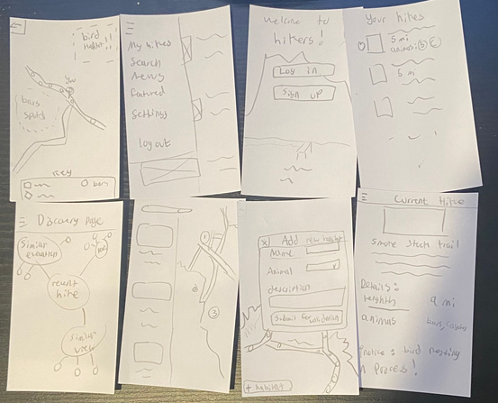
For this stage in the process I focused on creating a lot of simple designs in a quick iterative exercise calls Crazy 8s to create the starting frame work for the design. With multiple designs at my disposal I am able to pick specific features from each that I find will benefit the users the most. This iterative process allowed me to focus on creating a layout that makes navigation and usability simple. Based on my initial interview questioned I reasoned that if the app was quick and convenient to use that users would more likely be informed about wilderness preservation.
Digital Wireframes
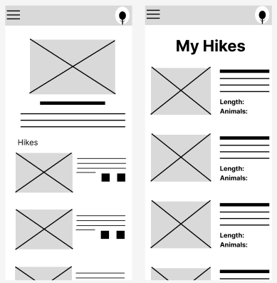
As I moved to creating the digital wireframes I continued to keep usability in mind so to address the main “pain points” users seem to have faced. Key features I included was a featured news section on the home screen as well as a list of users saved hikes. The news sections could be used as a way to share new wilderness preservation tactics to users and the saved hike list could function as a quick way for users to access wilderness information on their current hike.
Using index cards for paper prototyping helped simulate the dimensions of a smart phone.
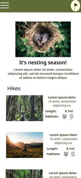
The home screen digital wireframe.
Low-Fidelity prototype
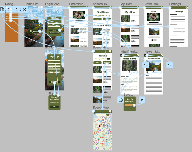
After creating digital wireframes for the main user flow in Figma I went through the steps to create the low-fidelity prototype to get feedback from a usability study. The low-fidelity prototype connected the primary user flow of finding a hike, saving it to your hiking list, and looking at the relevant habitat information associated with that hike. Before presenting it for the user study I took some time to review the flow to add any missing pages to improve the users experience before getting feedback.
If you are curious you can try it out using this Figma link.
Refining the design
Usability study
After the completion of the Low-fidelity prototype it was time to get some feedback from users to see if their pain points were being addressed and new pain points weren’t being created. After collecting the feedback from several users some of the main issues came from finding new hikes for users to explore. Users were looking for a way to filter the search page for hikes using specific parameters such as length and difficulty. Along with that people were a little confused with the default search page taking you to a map screen with locations. In connection with the previous issue users wanted to find a hike by a difficulty first before searching the map. Taking the users comments into mind work it was time to work on the mockups and incorporate some changes to the layout.
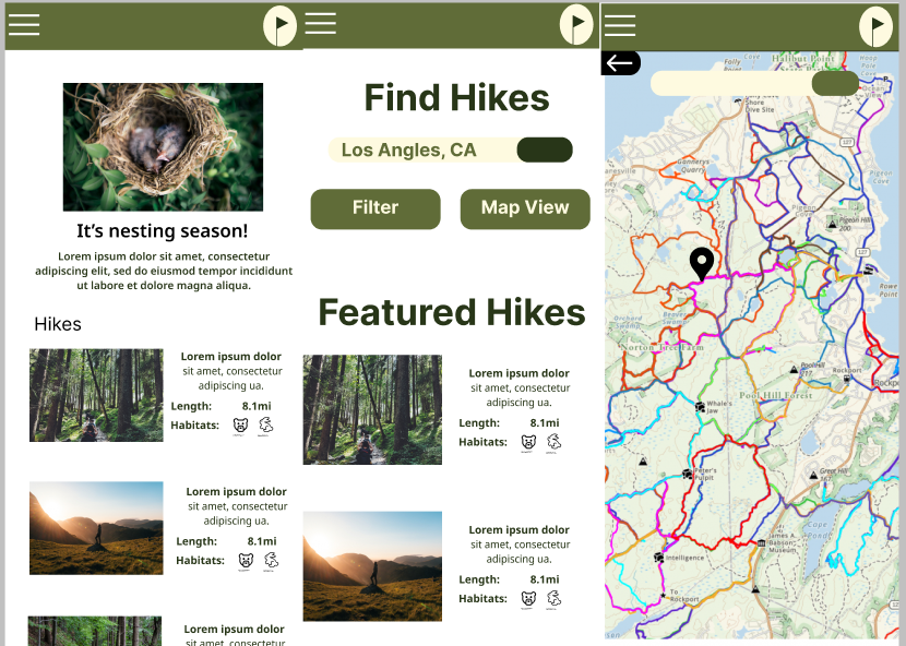
The new changes to the search and navigation menu
Mockups
Utilizing my findings from the usability testing I started adding color and updating the layout for the mockups to bring the app to life. One of the major changes was searching for a new hike, instead of going to the map page users would start with a traditional search bar and a list of related hikes. Users are the present with the option to search and filter hikes here or go directly to the map view if they choose. Now individuals can search in what ever way they prefer without much hassle.
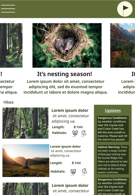
Along with this I desired to add some quick reference icons and descriptions for when users are scrolling through the list of hikes. This allows for some of the important details such as length to be readily available to users so they can quickly find a hike that is an appropriate length for what they desire. I also included little icons of animals as an indicator to what habitats users should look for when out on their hikes. These icons are paired with more information on the hike detail screen but it lets users know at first glance what animals to look out for.
Hi-fidelity prototype
The high-fidelity protoype followed the same user flow as the low-fidelity one with the inclusion of some additional confirmation screens and the changes from the usability study.
If you are interested in checking it out for yourself you can use this Figma Link.
Responsive Design
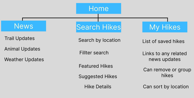
Sitemap
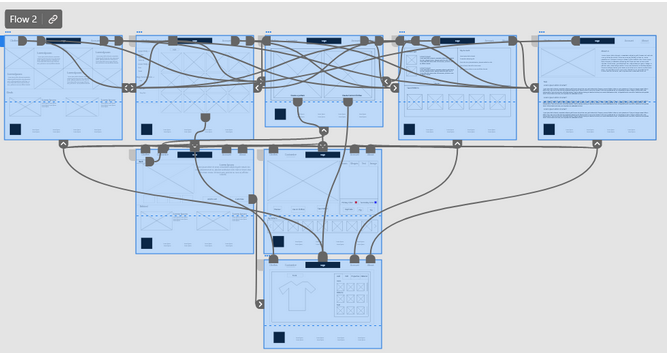
With the app design completed, I started to work on designing the responsive website. Using what I had already created as a base I quite assemble a site map of the important webpages I would need to guide the organizational structure of the website. I wanted to make sure each screen’s designs created a cohesive and consistent experience across devices. The sitemap allows me to easy create the layout for the website and think through how the user flow might change from mobile to web.
Responsive Designs
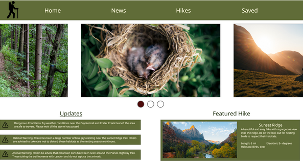
Here are the examples of the mockups I made for mobile, web, and tablet to account for how the app would change with the different screen sizes.
Going Forward
Takeaways
Through out this design process I learned the importance of Progressive Enchantment, creating designs from mobile then scaling up to larger screens, in creating a consistent design between a mobile and web application. I recognized that this app concept would primarily be as a mobile app but I saw the potential of a web based version that I did not want exclude so it was the perfect opportunity to utilize the concept of progressive enhancement. Utilizing this design concept has helped me ensure a useful experience for both types of users.
Next Steps
If i was to continue iteration on this app I would start with another round of usability testing to study whether all the pain points users initially experienced have been effectively addressed through the current apps design and features. Along with this I would want to add more educational research for users interested in wilderness knowledge. There are times when I am out on a hike and wish I could learn more about a specific tree or animal but lack the knowledge. Being able to continuously add and update wilderness information in the app to keep it up to date for users would be a perfect addition. Also being able to pair the app with local state park services would be a great way to come together as a community to support our forest reserves.
